


Design Projects
-
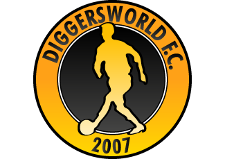
Diggersworld FC - August 2008
For the past year I have been a beta tester for Sports Interactive's upcoming game 'Football Manager Live'. Members are able to create their own teams and then compete which each other in competitions and friendlies. The game offers a lot of customisable features which make each manager unique.
My particular interest was in the design and interface of the game. I started by naming my squad 'Diggersworld FC' and then went on to choose my kit. I chose a combination of black and orange as I thought that with the name 'Diggersworld' people might relate my team to JCBs and mechanical diggers alike.
With this in mind I designed a logo or badge for my team which worked really well at the time. However this version is new and improved and was created using Adobe Illustrator. The source file is solely a vector image which allows me to resize it without pixelisation and also use it within Flash amongst other applications.
If you would like to know more about Football Manager Live then visit their site at www.footballmanagerlive.com.
-
Alien Inferno - May 2007
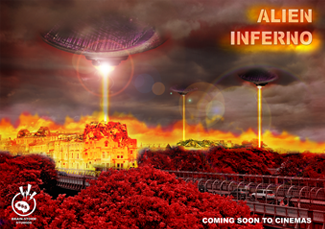
This poster was designed as part of an assessment for my Digital Graphic Art and Design module using Adobe Photoshop. The assignement required the design of an A2 poster that targetted a specific audience and being a film lover, I decided to create an advertisement poster for an upcoming 'B' movie called 'Alien Inferno'.
Using a landscape photograph I had taken, I darkened colours, added stronger clouds and used layered effects to create mood. Photographs of some speakers and a camera lens were merged to create the space ships which were textured using an image of a beach at night making them look truly alien.
Bright colours were added along the horizon line to make it appear as if the buildings were burning from the beams of the UFOs above. An image of a scrapheap was used to make the buildings appear as if they had been damaged on the rooftops.
I also had to produce a logo for 'Brain Storm Studios' which can be seen in the bottom left hand corner.
-
Panda Airways - May 2007
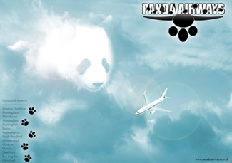
This poster was an early practise for my Digital Graphic Art and Design final project (shown above). In a different course module I was creating an online booking system for a mock company called 'Panda Airways', which required the use of PHP and MySQL.
I decided to base this practise poster on that peice of work and began by obtaining pictures of clouds, planes and pandas which I then needed to bring together. I started with the clouds as my base layer and then I faded the Panda in to make it look as if it were a shape in the clouds. My idea was that the Panda could be watching over the safe flight of the passengers on board the plane, and so I positioned the plane in a manner that the Panda was overlooking it.
I then created the 'Panda Airways' logo located top right, using a paw print and some wings. I positioned some text to the bottom left that listed where the flight travel to and from, and included a link to the website, in the bottom right corner.
-
User Integration - April 2007
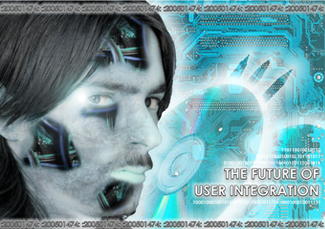
This poster was designed as part of an assessment in Digital Graphic Art and Design using Adobe Photoshop. Having a strong interest in computing I thought I'd try and show off my computing side.
Starting with a basic self-portrait I added texture details to my face before eventually adding wires to give it a robotic effect.
I then added some CDs and pens to try and highlight my creative side as well. A circuit board was added in the background to add to the technological effect. Part of the assignment also stated that I needed to include my student number in the image, so I encorporated it as serial numbers running accross the top and bottom of the image.
I then finished off the image with the title 'User Integration' surrounded by a representation of binary code, along with some layer effects.
-
Cresecendo Logo - March 2007
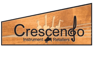
This logo was designed as part of an assignment for Digital Graphic Art and Design. I decided to produce this logo for a mock company 'Crescendo' who specialise in instrumental retail.
The logo features a stave that gradually widens from left to right, as the crescendo symbol would on a music sheet. I replaced the 'd' in Crescendo with a treble clef to enhance the relation with music. I then added music retailers as a subtitle, and added a few small image of various instruments.
To finish it off I mounted the image on a wooden background and used the tool to make it appear as if the logo was set upon the wood, like you would see on most wooden instruments.
-
The Cold Wars Signatures - March 2007
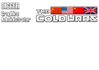
This signature along with a dozen other were produced for use on 'The Cold Wars' forum so that users could quickly identify whether a post was that of a gaming staff member.
I used the same typography I had designed in the logo (shown below). I had quite a bit of black space remaining after the initial layout, and thought I would include the flags of the four factions in the game, these being the USSR, USA, China, United Kingdom.
-
The Cold Wars Logo - February 2007
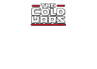
This logo was produced for an online MMORPG called 'The Cold Wars' which is based on what could of happened during the cold war.
The producer of the game wanted a small logo which could be used in the header of the forums as at the time he was using a template image which related to a different game.
I designed the typography and surrounding design in Macromedia Freehand, and then used Adobe Photoshop to add some texture effects.
-
Typography - February 2007
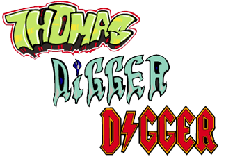
These examples of typography were produced as an introduction to Macromedia Freehand. I learnt how to use various different tools within the application, specifically the pen tool.
The first typography example is based on graffitti, I had always wanted to create something cool looking, like a lot of the images and phrases you see written across walls in towns or cities.
The second example is based on a spooky/haunted style, so I used cold colours and tried to make the letters resemble candle stalks, this is highlighted by the flame on the 'i'.
The third example is based on a rock/metal schema, similar to that of AC/DC, being a fan of their music I created the letters to represent my nickname, which worked to great effect, making my nickname look really cool.
-
1st Infantry Battalion (Splash Page) - February 2006

This splash screen was produced for a multi-gaming community. Their site admin specified what images he wanted used, and gave me a general idea of what he wanted.
I started with the coin as the centre peice, then started working outwards, creating segments, for a link to each of the different games they played. Once I had the circle area done, I added some horrizontal lines, and created a military badge style look, adding in some more images as well as the communities name.
Some stars were added to the top for extra effect and a ribbon was added at the base of the circles with the clans motto upon it.
The colours were kept quite dark to match the website style at the time. The site admin then added the links to the differing game sections on the site.